Kalishnikov’s Dream

Until a couple of years ago, the Ontario Society of Artists’ annual Open Juried Exhibition (OSAOJE) had a theme each year. In 2013, the theme was Unintended Consequences, and that tied in with some things that were running around in my head at the time. For some reason, I had read the Michael Kalashnikov regretted inventing the AK-47, as it had been used for so many awful things that he never intended. Not everyone believed his regrets, but still – interesting link for Unintended Consequences.

Here’s the final image. I’ll go through my thinking and some technical aspects below. Note: All the images are from the Internet; I was unable to get clear attribution on any of them, since various organizations had re-posted the images without attribution.

A photo collage of Mikhail Kalashnikov & child soldiers with an AK47
Kalashnikovs Dream

From the beginning, I wanted the child soldiers represented in overlapping ranks, with colouring that would look like a flag. I started with a single image and trimmed out all the background. Overlapping was much harder than I expected, especially since I wanted the central child soldier in each rank to be in front of those to each side, as you can see. There was a lot of positioning by pixel coordinates, then grouping, copying and pasting in new positions. The colour bands are rectangles, sized by pixel dimensions and partly transparent. I also checked to make sure that the colours I had chosen did not match any existing flag, because it’s not about any specific conflict.

The AK-47 is simple isolated from its background and given a golden glow so it floats above everything else.

My original thinking for the left side was to have a map of Europe at the end of the Second World War, with AK-47s pointing out from the USSR like the defensive line Kalashnikov wanted. There was a little infographic comparing intended defence and unintended child soldiers. It just didn’t work.

Then I got the idea to have the 3-frame graphic novel you see in the final version above. Turning a photo into an image that looks like it’s from a graphic novel took a lot of interesting learning. Here’s a clip showing the third frame’s layers.

How I made Kalashnikov Frame3

You can see that there are two layers with the base image of his face (which I tilted to reflect how traditional portraits are made, and to add a sense of motion). The upper layer is partly transparent so that, when the modifications are added, the unaffected bottom layer still shows through. This adds a little definition to the final result. The three adjustment layers are, in order, brightness/contrast, threshold and posterize. Together, they create the pen-and-ink effect I wanted. The top two layers are for the thought clouds and text.

This is one of my favourite images, not just for the technical difficulty and the learning I had to do, but for all the thinking I had to do to relate it to the OSAOFE theme. I hope it makes you think, too. I doubt it will ever sell, though.

(BTW, I have another Unintended Consequences image in mind, based on the American Constitution’s Second Amendment, layered with their Founding Fathers and maybe a single day’s worth of American gun violence.)
Prospect houses

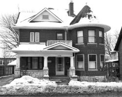
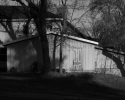
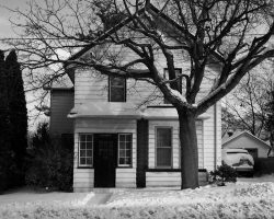
Prospect House 1

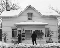
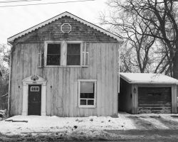
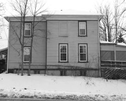
Newmarket’s Prospect Street has many lovely houses. It is a troubled street, though, required to handle many more cars, trucks, emergency vehicles and, recently, GO buses. Between Timothy and Queen, the section I live nearest to, the road  is narrow, even though you can see that it was widened in the past to accommodate cars. On top of that, there’s on-street parking. It’s a hard street to walk beside, let alone cycle on.

There are many rental housing units in converted houses on this stretch of Prospect, as well as a number of group homes and a seniors’ residence. Quite a few locals do not drive, and some have mobility issues.

I suspect that over the next few years we will see houses in this area torn down and replaced with condos. I wonder what will happen to the current residents; where will they live? Will the Town and Region (and Province) strengthen requirements for affordable housing?

These photos are just sketches really, quick images taken over a few days in Winter, with the thought that the “real” pictures would be taken in the Spring. But now, when I worry about the possibility that the houses may not last, maybe quick sketches are best.

Modern landscapes

Photo of trees seen from a speeding car

I have been investigating how we see landscape now. In the past, in Canada and in North America, landscape imagery has had a heroic aspect. Landscape paintings, mainly by the early Group of Seven, have formed our concepts of who and where we are. In reality, very few of us have been to the places shown, and nowadays we see landscape, if at all, whizzing past our car windows.

It’s not just that I used a low shutter speed here, about 1/6s. I had to use a wide-angle lens with a neutral-density filter, otherwise I wouldn’t have been able to get that low a shutter speed.

To me, a photographic artist tries to show things not normally seen, or to show the mundane things we overlook. With the Modern Landscape series, I’m trying to do both: show you the landscapes you drive past, but make you realize that they are worth looking at.

PATH to Emptiness

Photographer’s notes

This series was taken early on a Sunday morning in Toronto’s underground PATH. As I was walking around in the deserted commercial space, I began to see it as a metaphor for the emptiness of our consumer lifestyle.

In all frames, note the hard linear wall surfaces, and the grid of the floor tiles. Nearly every image also holds some commercial signage.

I shot with a high ISO as I had no tripod; the resulting graininess enhances the images. Nothing in any of these images (except The Black Gate) was arranged – it’s all shown as it was. As well, all the images were shot full-frame.

Frame 1: The final rainbows

The bright daylight from beyond the door leaves a spectrum on the floor, echoing the rainbow motif on the wall. The rest lies in shadows.

Frame 2: The beacon

The bright light shines from between the escalators and the stairs. Reflections from the black and clear surfaces continue the scene to the right and through the stairs and escalators. The blue glow is also seen at the end of the series.

Frame 3: The Messengers

The wide angle view emphasizes the isolation of the Messengers near the corner. Their lively colours contrast with the bland setting. They looked like they were waiting to escort me somewhere.

Frame 4: The Black Gate

I had to work at not getting my reflection in the black surface, though I also tried in other images to have my reflection sitting, ghostlike, on the bench.
The image has been reversed to make it look as if the Moneysworth & Best and other stores are behind The Gate. This necessitated re-reversing the logos on the recycling/garbage bin. The low point of view emphasizes the leading lines in the floor, ceiling and lights, and the obstacle between you and The Gate.

Frame 5: The descent

The structure of the lighting is reversed from normal: the near scene is darker than the distance. The lights over the stairs work with the opening to the descending walkway to form a maw, drawing you down the slippery path toward the light.

Frame 6: The holding pen

The black, angled framing emphasizes the glow from the lights, especially the distant blue glow. The chrome chair legs form spiky barriers, but there are clear pathways. And one chair stands ready. Who is it for?

Frame 7: The Empty Throne

Three tables, three chairs, reminiscent of Cerberus. That cold blue glow.

Shows:

This series was first shown together at The Aurora Cultural Centre in 2012. The descent and The Empty Throne were in The Uxbridge Juried Exhibition in 2012, with The descent winning Best Photography.

Many cameras, few Photographers

Few people are actually familiar with what goes into making a photograph, and what is needed to appreciate one.

At the moment of creation, photographers must choose the right framing of the right objects, with the right lighting, at the right moment. The exposure time, f-stop and ISO setting all must be chosen for their proper effects (for example, blurred motion, out-of-focus background (or foreground!) and graininess, respectively).

A multitude of things can be adjusted in the processing – contrast, brightness, colour balance… it’s really easy to overdo it.

In printing, the paper must be matched to the image, with an understanding of how the paper’s characteristics will affect the printed image. The camera, monitor and printer must all be matched

When you look at a photograph, consider the photographer’s choices of subject, framing, lighting, proximity, flatness (or bending) of the field of view, colour, sharpness (or blurring) of focus, depth of field, graininess, brightness, contrast, motion, paper texture and colour, layering or juxtaposition, and so on. Really look.

Then ask – Does this photograph make me see and think differently

PixSilver Images