Newmarket Graffiti

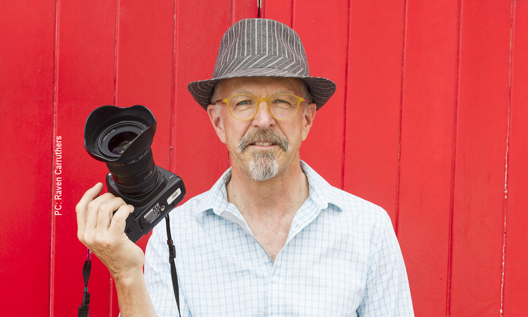
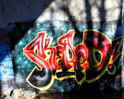
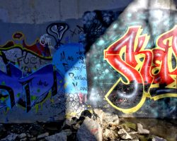
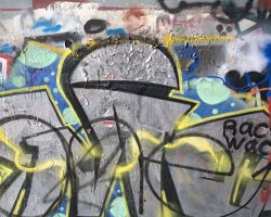
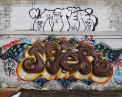
Graffiti freestyle with metallic paint

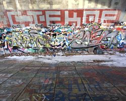
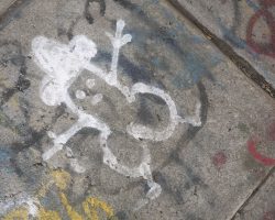
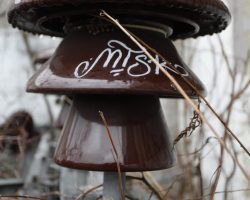
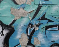
I actually found some graffiti in Newmarket that I could enjoy! Most of the graffiti around here is really poor – kindergarten stuff – runny tagging, boring, blech!

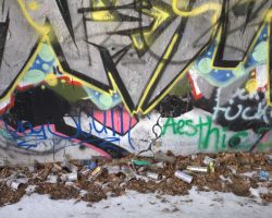
What I found actually has some freestyle along with layers other work. Even the setting is interesting – much as I dislike litter, the discarded spraycans add to the image.

For more of my thoughts on graffiti, see my earlier post: Photographing Graffiti

Kalishnikov’s Dream

Until a couple of years ago, the Ontario Society of Artists’ annual Open Juried Exhibition (OSAOJE) had a theme each year. In 2013, the theme was Unintended Consequences, and that tied in with some things that were running around in my head at the time. For some reason, I had read the Michael Kalashnikov regretted inventing the AK-47, as it had been used for so many awful things that he never intended. Not everyone believed his regrets, but still – interesting link for Unintended Consequences.

Here’s the final image. I’ll go through my thinking and some technical aspects below. Note: All the images are from the Internet; I was unable to get clear attribution on any of them, since various organizations had re-posted the images without attribution.

A photo collage of Mikhail Kalashnikov & child soldiers with an AK47
Kalashnikovs Dream

From the beginning, I wanted the child soldiers represented in overlapping ranks, with colouring that would look like a flag. I started with a single image and trimmed out all the background. Overlapping was much harder than I expected, especially since I wanted the central child soldier in each rank to be in front of those to each side, as you can see. There was a lot of positioning by pixel coordinates, then grouping, copying and pasting in new positions. The colour bands are rectangles, sized by pixel dimensions and partly transparent. I also checked to make sure that the colours I had chosen did not match any existing flag, because it’s not about any specific conflict.

The AK-47 is simple isolated from its background and given a golden glow so it floats above everything else.

My original thinking for the left side was to have a map of Europe at the end of the Second World War, with AK-47s pointing out from the USSR like the defensive line Kalashnikov wanted. There was a little infographic comparing intended defence and unintended child soldiers. It just didn’t work.

Then I got the idea to have the 3-frame graphic novel you see in the final version above. Turning a photo into an image that looks like it’s from a graphic novel took a lot of interesting learning. Here’s a clip showing the third frame’s layers.

How I made Kalashnikov Frame3

You can see that there are two layers with the base image of his face (which I tilted to reflect how traditional portraits are made, and to add a sense of motion). The upper layer is partly transparent so that, when the modifications are added, the unaffected bottom layer still shows through. This adds a little definition to the final result. The three adjustment layers are, in order, brightness/contrast, threshold and posterize. Together, they create the pen-and-ink effect I wanted. The top two layers are for the thought clouds and text.

This is one of my favourite images, not just for the technical difficulty and the learning I had to do, but for all the thinking I had to do to relate it to the OSAOFE theme. I hope it makes you think, too. I doubt it will ever sell, though.

(BTW, I have another Unintended Consequences image in mind, based on the American Constitution’s Second Amendment, layered with their Founding Fathers and maybe a single day’s worth of American gun violence.)

The Fallen

Catalog of The Project Examining the Fall

February, 2125

Preface

We do not know the population of the Earth. We do not know the breadth of the empty lands or whether other areas thrive.

We are 2,537.

Protected by lakes and frequent rains that keep our forests from burning, we are safe and often comfortable. We are able to endure the storms and other unpredictable weather. Like children, we have known no other lives, yet we are often reduced to tears of loss and loneliness.

That is the purpose of our project – to examine what we know of what we have lost, what was taken from us long before our births. How do we know what we know? What are the puzzle pieces and how do they go together? And why, after all this time, do we all care so very much?

We are gleaners. Shuffling through the scraps and waste of those who fell, we find things. And here, even though all the roads were long ago dug up, wanderers find us. Almost all stay. Almost all carry some paper, some fragment or scrap, burned, torn, soiled and somehow holy, blessed by mere survival.

We have books from before the first fall, many from the time of the slide. We have scraps of writing – magazines, newspapers, even personal notes and images – that survived, somehow, even through the collapses and the burnings. Most of what we have are just scraps.

When the Project began several years ago, we had one central question: What happened? How is it that we are living in the remains of a civilization that fell to this, our current state of living close to the land, close to the bone, far from others? We hoped that we could sort through our collected books, papers, pictures and scraps, develop explanations and interpretations, and then figure out what happened, what caused the fall.

As we worked, as we learned more and more, as we came to prove that the clear signs of global climate change had been ignored until it was far too late, we saw that it no longer matters just what happened – our climate is different from before, our civilization is different from before, this world is just our world.

We shared our scraps, and talked and debated their meaning, and our central question became this: Can we forgive? If we cannot forgive those who brought about our current fallen state, will we ever be able to learn to live our lives in circumstances as they are?

The Works

Beauty, it seems, has often been paired with temptation and destruction.

In Copper Sky, you see soaring towers carrying wires across the sky, transporting electricity to light up their lives, while clouds loom, both beautiful and threatening. Now, perhaps more than then, we are in awe of the power of storms, both for their beauty and their power.

Too Cheap To Meter and Base Load show us how the night sky glowed then, with wasted electrical light. The texts displayed with them tell of the hubris, the folly, of those who truly believed, even after it was known that the climate was changing, that they could live like that, forever.

Base Load is also accompanied by a fragment from the time of the Slide, when rumour became news, and any sort of study, scientific or social, was nearly lost.

In Melt My Ice Cream, a rant against the ruination of the Earth is made of ideas that were “in the air” early in this century. It was recovered by researchers mining data from a web archive server found at facilities in Los Alamos in what was the state of New Mexico. The date of its writing, about 2015, was, according to our research, about the time it became too late to do anything, as the threshold to runaway climate change was passed. Was the anger found in this rant a portent of the violence that was to come?

And what are we to make of the small sculpture depicting a hooded prisoner, apparently representing Nature, attached to electrical power lines?

Conclusion

We print on paper we make, with machines we have salvaged and kept working. Paper fades, and our future is still uncertain. We have made copies etched in glass. If you are reading a glass copy, mourn our passing, and celebrate your survival.

The Archivists of The Project

2124

Modern landscapes

Photo of trees seen from a speeding car

I have been investigating how we see landscape now. In the past, in Canada and in North America, landscape imagery has had a heroic aspect. Landscape paintings, mainly by the early Group of Seven, have formed our concepts of who and where we are. In reality, very few of us have been to the places shown, and nowadays we see landscape, if at all, whizzing past our car windows.

It’s not just that I used a low shutter speed here, about 1/6s. I had to use a wide-angle lens with a neutral-density filter, otherwise I wouldn’t have been able to get that low a shutter speed.

To me, a photographic artist tries to show things not normally seen, or to show the mundane things we overlook. With the Modern Landscape series, I’m trying to do both: show you the landscapes you drive past, but make you realize that they are worth looking at.

New square work

I’ve been working pretty hard getting ready for the 2017 NGA Studio Tour. Matting and framing, mainly; learning how to use the new grids I bought. Printing greeting cards. Finding old work and re-framing some of it – I swap frames a lot (doesn’t everyone?)

So – why am I making new work? It’s so time-consuming, even for a photographer. I get it that painters, stained-glass artists, jewellers etc have even more reason to try to avoid new work, but still – it’s work. And while I’m asking myself this, why am I blogging?

Thing is, I had a couple of 20×20 square frames that had work I don’t want to show this year, so I thought I could sub in some new stuff. I usually shoot full-frame, so not much of my work is open to radical re-formatting to a new aspect ratio.

So – meet “Afternoon Lily” – Peggy tells me it’s a Montego Bay.

Photo fo a Montego Bay lily blossom
Afternoon Lily

Printed, it has a luminosity that doesn’t really come across on the screen, which is pretty unusual. It works in square format because that allows the blossom to burst out of the frame.

And meet “Pitcher Plant” too. It’s a Sarracenia purpurea. I took the photo up near Parry Sound. Again, it works square because it pops out of the frame.

Photo of a Sarracenia purpurea pitcher plant
Pitcher Plant

When I showed Rachel “Afternoon Lily” and we talked about the square format, constraints, coming out of the frame, etc, she said: “It’s like the world, isn’t it?”

I can’t add much to that.

PATH to Emptiness

Photographer’s notes

This series was taken early on a Sunday morning in Toronto’s underground PATH. As I was walking around in the deserted commercial space, I began to see it as a metaphor for the emptiness of our consumer lifestyle.

In all frames, note the hard linear wall surfaces, and the grid of the floor tiles. Nearly every image also holds some commercial signage.

I shot with a high ISO as I had no tripod; the resulting graininess enhances the images. Nothing in any of these images (except The Black Gate) was arranged – it’s all shown as it was. As well, all the images were shot full-frame.

Frame 1: The final rainbows

The bright daylight from beyond the door leaves a spectrum on the floor, echoing the rainbow motif on the wall. The rest lies in shadows.

Frame 2: The beacon

The bright light shines from between the escalators and the stairs. Reflections from the black and clear surfaces continue the scene to the right and through the stairs and escalators. The blue glow is also seen at the end of the series.

Frame 3: The Messengers

The wide angle view emphasizes the isolation of the Messengers near the corner. Their lively colours contrast with the bland setting. They looked like they were waiting to escort me somewhere.

Frame 4: The Black Gate

I had to work at not getting my reflection in the black surface, though I also tried in other images to have my reflection sitting, ghostlike, on the bench.
The image has been reversed to make it look as if the Moneysworth & Best and other stores are behind The Gate. This necessitated re-reversing the logos on the recycling/garbage bin. The low point of view emphasizes the leading lines in the floor, ceiling and lights, and the obstacle between you and The Gate.

Frame 5: The descent

The structure of the lighting is reversed from normal: the near scene is darker than the distance. The lights over the stairs work with the opening to the descending walkway to form a maw, drawing you down the slippery path toward the light.

Frame 6: The holding pen

The black, angled framing emphasizes the glow from the lights, especially the distant blue glow. The chrome chair legs form spiky barriers, but there are clear pathways. And one chair stands ready. Who is it for?

Frame 7: The Empty Throne

Three tables, three chairs, reminiscent of Cerberus. That cold blue glow.

Shows:

This series was first shown together at The Aurora Cultural Centre in 2012. The descent and The Empty Throne were in The Uxbridge Juried Exhibition in 2012, with The descent winning Best Photography.

Scanograms – a new medium?

There are things I miss about traditional “wet darkroom” photography – the magic of watching an image appear in the developer; the photogram, where objects are scattered on photographic paper, which is then exposed and developed; even the anticipation during the time, often days or weeks, between the exposure and the print. Scanograms use a technique I have invented to create the digital equivalent of the photogram. I open the flat-bed scanner and start a scan. I then “paint” with some object – in this case a tulip – over the moving scanning bar. I don’t get to see the result until the scan finishes, so I also get back some of the anticipatory delay that I have missed.

If you look closely, you will see bands of red, green and blue around some of the scanogram’s features. These are a result of the way the scanner works – sequentially scanning in the digital primaries – combined with the flower’s motion.

The only processing I do on the result is to (laboriously) take out the inevitable dust spots. I also crop it a little bit to make its proportions better for standard frames.

Gone live!

So here it is at last – Aug 31, and I just set up the linking so pixsilver.com shows my new site. I will add more galleries, change up the images from time to time, continue writing, and get guests to write.

It’s still a work in progress, but so is my art. And so am I…

Please leave comments to let me know what you think.

Dave

Photographing graffiti

Photographing graffiti has a long history in photography. It brings the usually anonymous wall markings to a broader consciousness, serving as “an equivalent of oral history – retrieving scraps of ordinary lives”. (Max Kozloff, in The Restless Decade – John Guttmann’s Photographs of the Thirties) These days, not all graffiti artists are completely anonymous – we’ve come a long way from Kilroy to Banksy! There are fans who could tell who made the stencil graffiti seen in my image of the laughing grenade, and probably the sprayed tag partly layered with it. Same with the digits in 10.

So – what am I doing here? Why take a picture of someone else’s art? Some will see it as appropriation – I’m not part of the graffiti culture, and understand very little of it. I prefer to think of it as sampling, more common now in music than in visual art. That’s why I framed it as I did – having the grenade and the tag both bursting out of the frame, showing only the top of the 10. I’ve made the images my own, and suggest the uncontrolled nature of the originals.

Many cameras, few Photographers

Few people are actually familiar with what goes into making a photograph, and what is needed to appreciate one.

At the moment of creation, photographers must choose the right framing of the right objects, with the right lighting, at the right moment. The exposure time, f-stop and ISO setting all must be chosen for their proper effects (for example, blurred motion, out-of-focus background (or foreground!) and graininess, respectively).

A multitude of things can be adjusted in the processing – contrast, brightness, colour balance… it’s really easy to overdo it.

In printing, the paper must be matched to the image, with an understanding of how the paper’s characteristics will affect the printed image. The camera, monitor and printer must all be matched

When you look at a photograph, consider the photographer’s choices of subject, framing, lighting, proximity, flatness (or bending) of the field of view, colour, sharpness (or blurring) of focus, depth of field, graininess, brightness, contrast, motion, paper texture and colour, layering or juxtaposition, and so on. Really look.

Then ask – Does this photograph make me see and think differently

PixSilver Images